Trading212 - Invest platform
Introduction
The assignment was about building a new platform interface solely targeted at users wanting to invest long term. From manual investing to creating long term auto-investment plans, e.g. Retirement, Large purchases, Home improvements etc. Therefore the interface vastly differs/should branch out from the current CFD(Contract for difference)-focused platform UI. The task is very complex and pivotal for the company’s future business targets/needs.
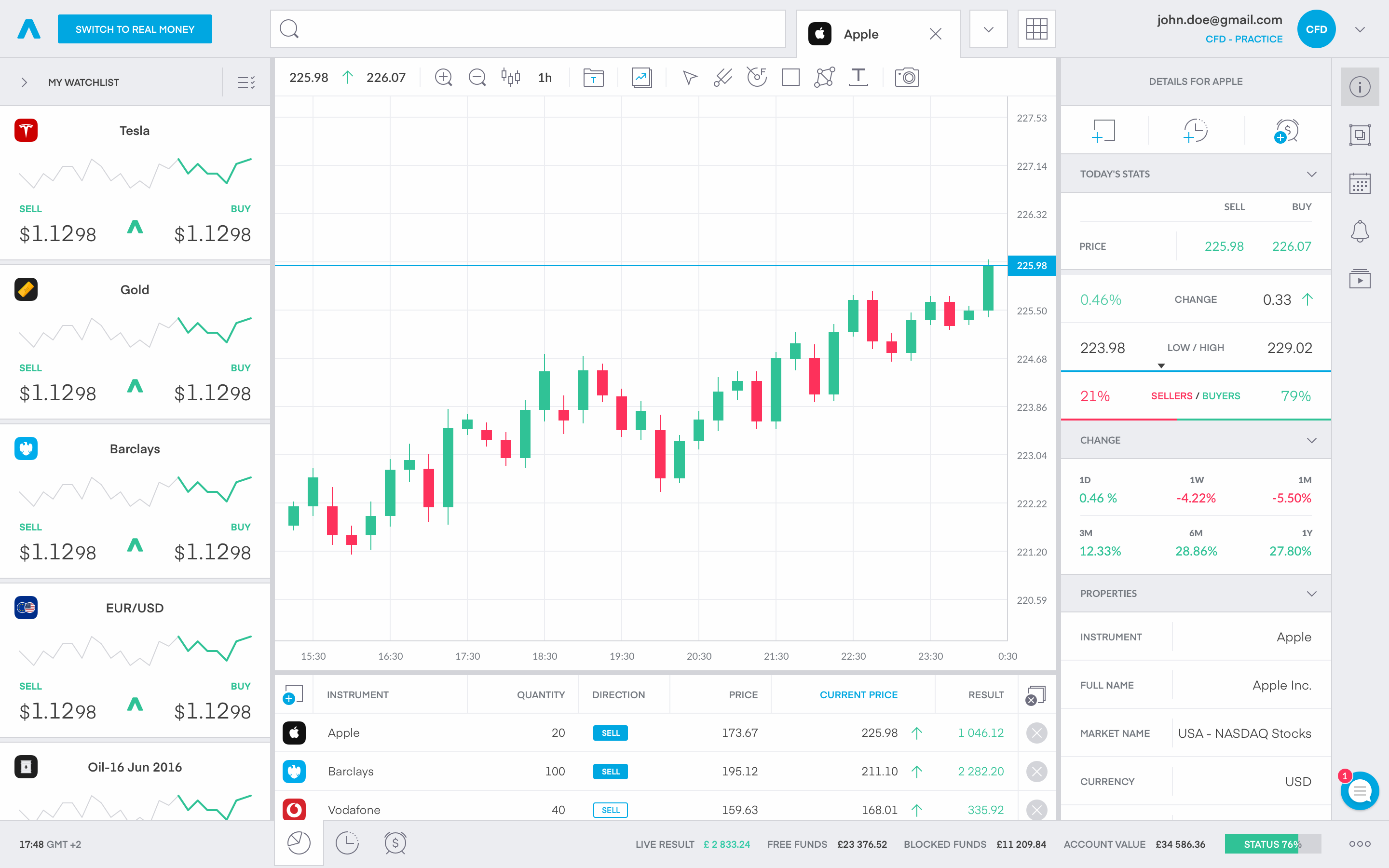
The best thing about working on this project was the scale, variety of challenges and problems to solve: from UI iterations to crafting a long term, sustainable product. Also our team decided to start from scratch, so there is little to none legacy limitations be it design/code base wise.
In this case study I will only be focusing on the 6 main tabs/pages, as I think that they show enough of the complexity and scale of the project, without being overbearing to the reader. 🙌
Goals & challenges
- Define a clear main structure of the platform and its most impactful sections/tabs
- Salvage components that can be reused with no regards to the primary state of the trading platform, so that we can ship a useful, viable product in the shortest time possible.
- Create a clear & non-deceptive experience for users with a long term focus
- Limelight hundreds of educational videos made by us to help our users
User Research Results
- Users don’t tend to make sudden/rapid investments, but more planned and prefer thorough research before committing to a specific portfolio/instrument.
- Users find the CFD interface highly cluttered and busy for the purpose of investing
- Many of our features are hard to find, and there is a steep learning curve with the UI
- Dialogs from the CFD focused platform are clear and concise enough so that they can live in the new UI and can be reused, cutting down implementation times.
1. Home
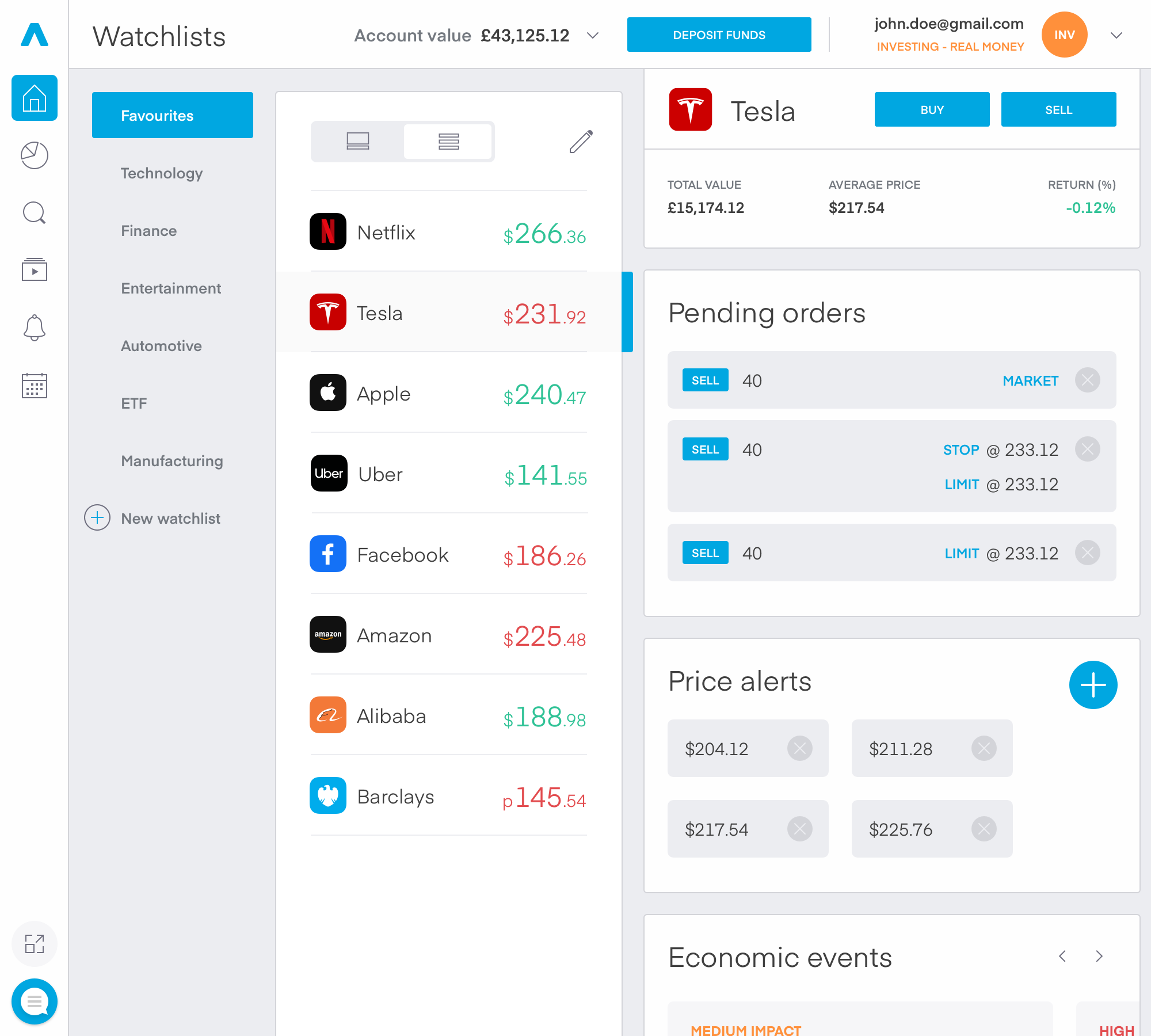
My main idea was keeping the UI as similar as possible to the old one since I didn’t want to introduce new complex mental models to the users. With that in mind, the platform needed a long-overdue visual update, so many of the components in our design system underwent a style refresh in line with our new brand guidelines, and respectively their new purpose.
After discussing it with our head of design we concluded, that in our case a tabular like navigation is the most suitable.
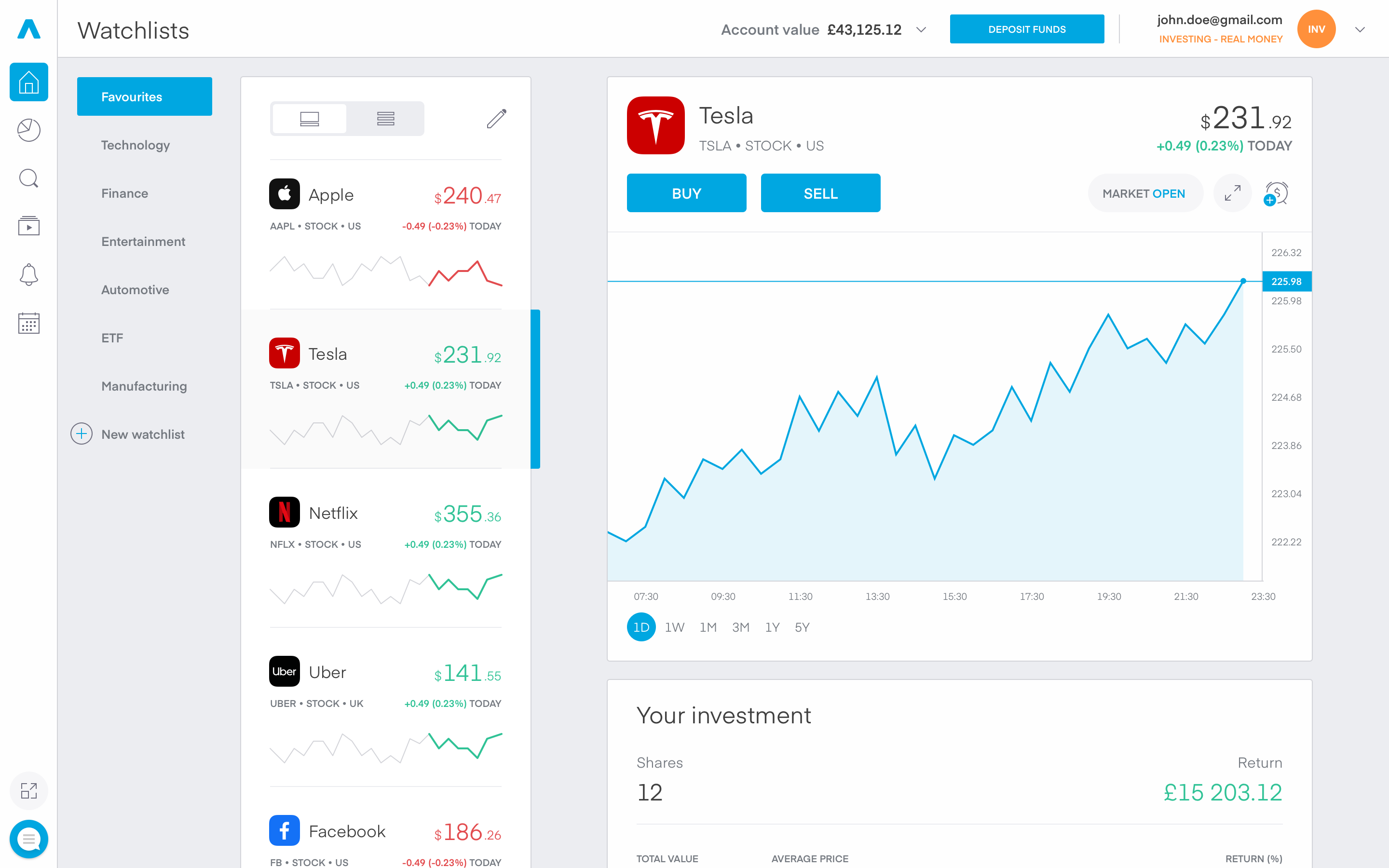
I opted to keep the position of the instrument list, with the now always-visible curated watchlists. On the right of it I positioned the details of the selected field. For me, the 3 column composition brings an understandable logical structure with rather easy navigation through the parent-child elements. The user will be able to scroll each column separately. We noticed a small downside to the structure, in which the user can lose context of the instrument they’re currently using. The solution was the introduction of a scrolled state of the Instrument details.
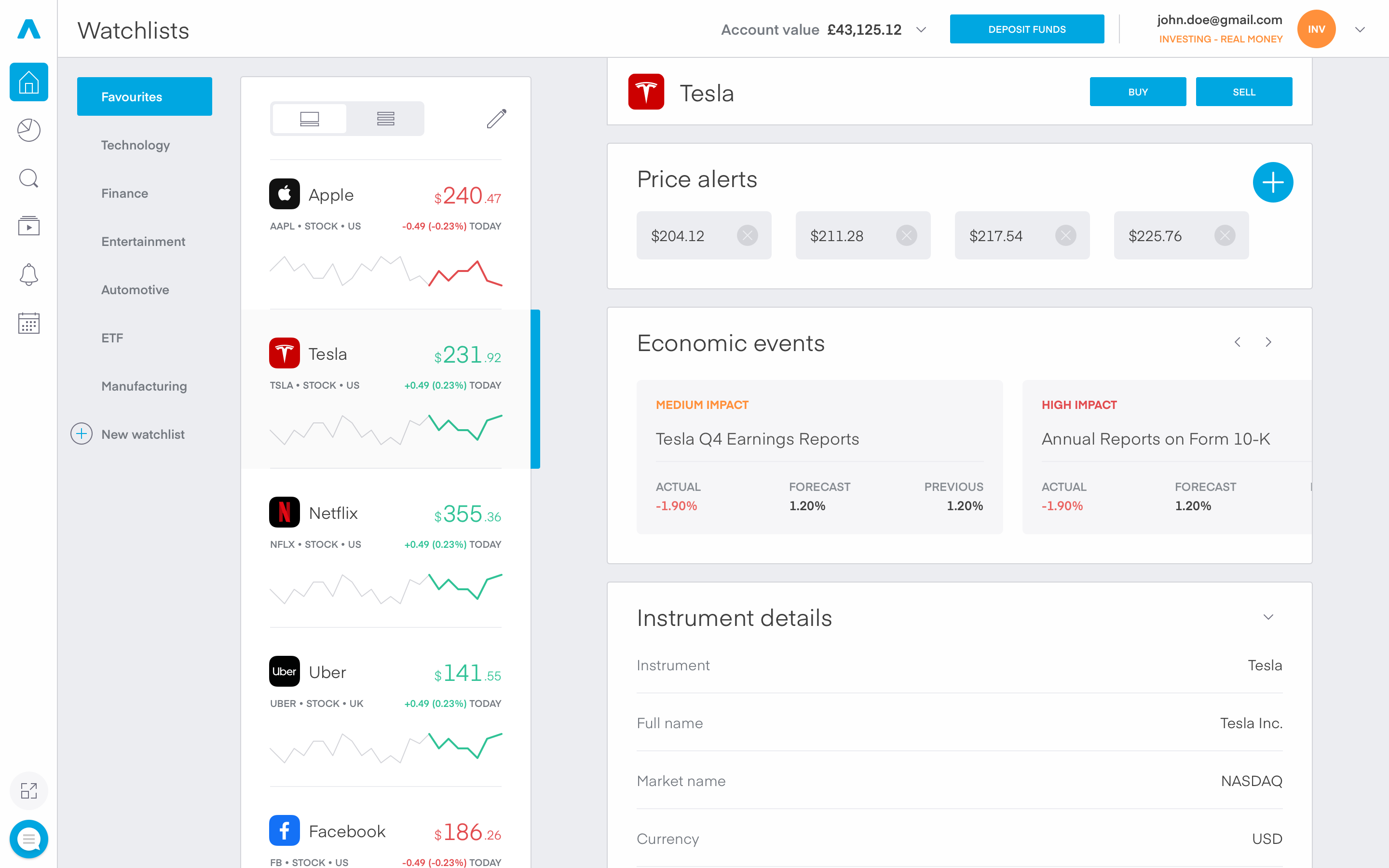
Responsive design
A whole lot of whitespace
The 3 column structure gave me freedom and simplicity in exploring the responsive breakpoints. The layout pretty much positioned itself around the screen, except for the sidebar. An interesting idea I wanted to try was detaching the sidebar and bringing the Advanced charting & Chat with us stack closer to the main navigation tabs, so that they don’t disappear at the bottom of the viewable area, with all the white space around them. The removal of the white background behind the sidebar lightened up the whole interface, in view to the additional screen estate.
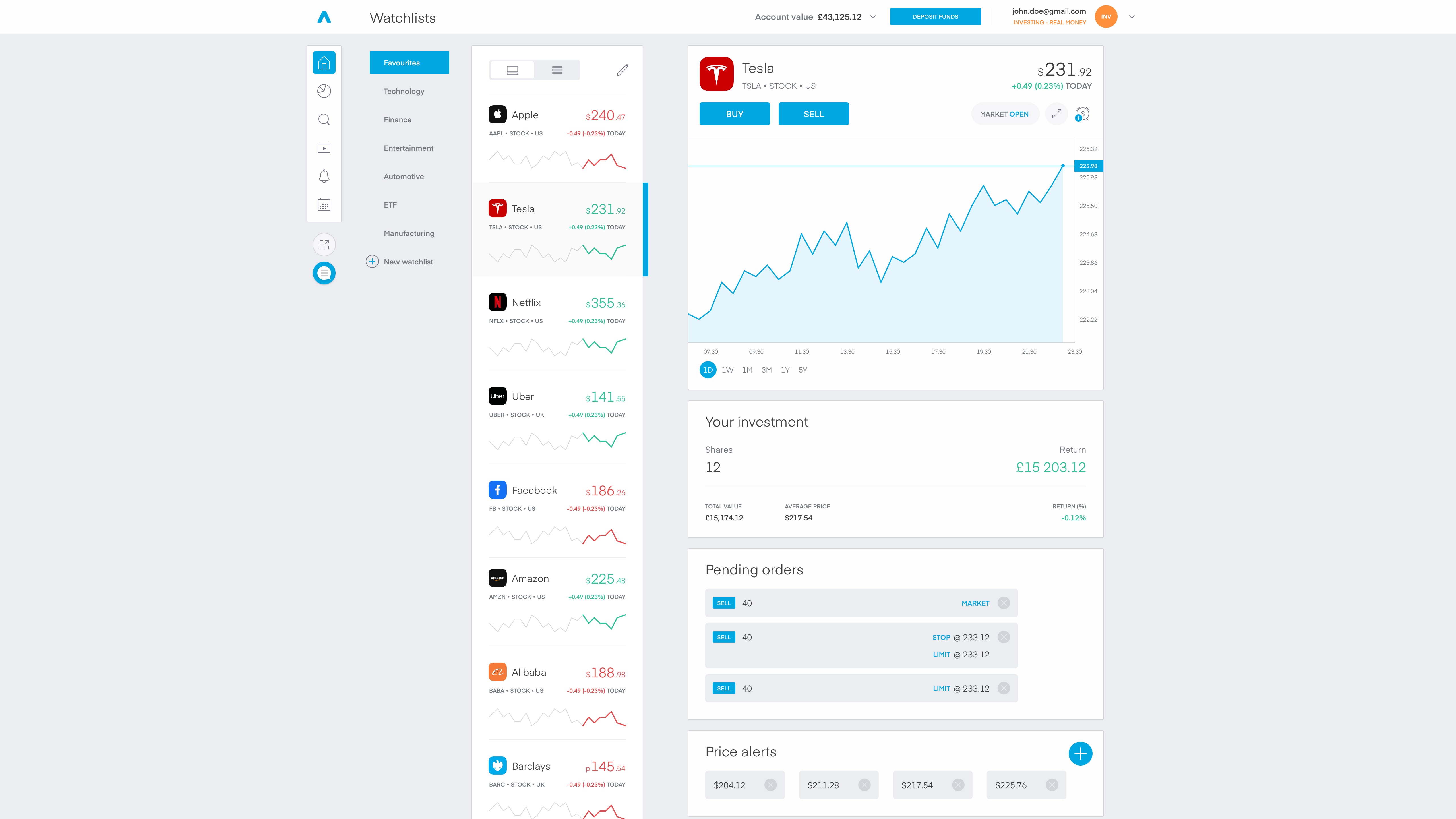
A whole NOT of whitespace
The minimal supported content width of the platform is 1000px, but that didn’t lead to any peculiar corner cases. The UI scaled down rather effortlessly, firstly the margins between the different components were going to be downsized to a minimum value, then the padding in the items and in some cases the typography also needed a little nudge. I won’t go into much detail as the product is localized in 11 languages, there are tons of corner cases concerning the typography and that is a whole ‘nother story…
2. Portfolio
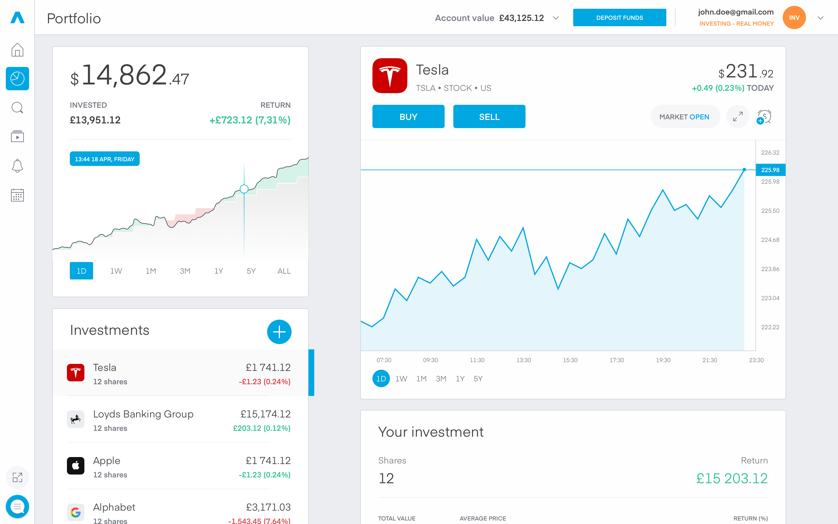
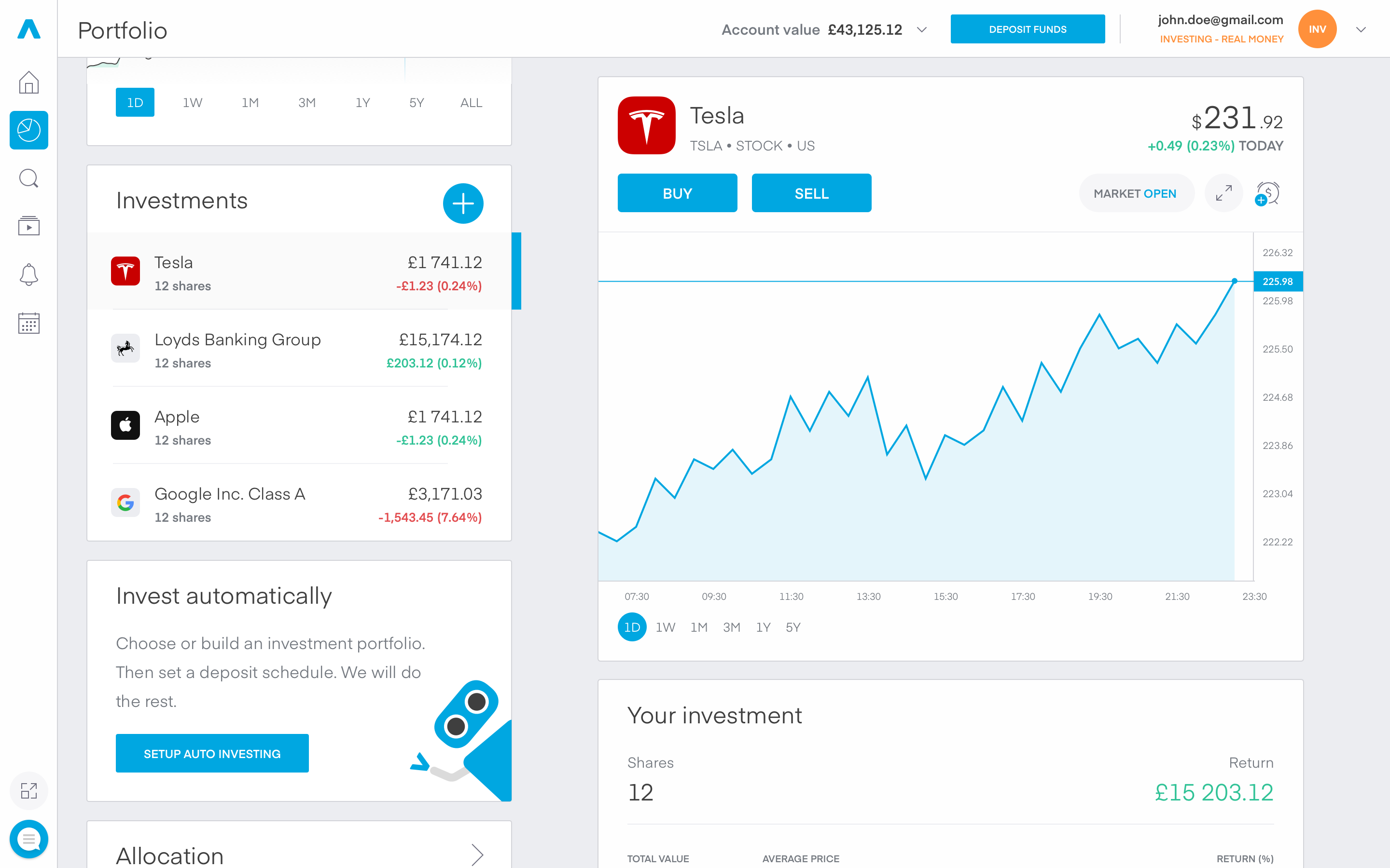
Maybe the most crucial part of the whole project. Here the users have a clear overview of their whole portfolio. A historical performance graph, manual/recurring investments, funds allocation and so on. I neatly stacked these components on the left, and when selected their detailed views appear on the right. In the process of creating the new investment UI we created a Trading 212 Community forum and luckily several of the most wanted features were overlapping with what we had in mind. With more than 10k daily active users, the project put a lot of weight on my shoulders, and threads like that are very reassuring!
3. Search
Maybe the hardest part of the project was the Search tab, I underestimated the task and that was rather silly from my side. I thought the whole thing is pretty straight forward, as the Search was a stand-alone component, which we could have reused from the CFD project. Well not quite… The placement of the search bar on the top navigation bar was strange, out of context and with the different main tab structure - rather illogical.
I couldn’t answer several important questions:
- The search bar looked like a global search, not an instrument exploration tool.
- How the user will know where/what he is searching?
- What is going to be the desired behavior and state of the current page the users are at, when clicking on the search field?
- Should we save the current state of the page they are at, when the users have navigated to a specific search result?
That made me redo the whole idealization of the search and scrap the initial idea I had. Back to square one… While designing the UI, the financial instruments our company offers have grown to more than 3000, that lead to some changes and improvements on the search, so that users can find and navigate easily around it.
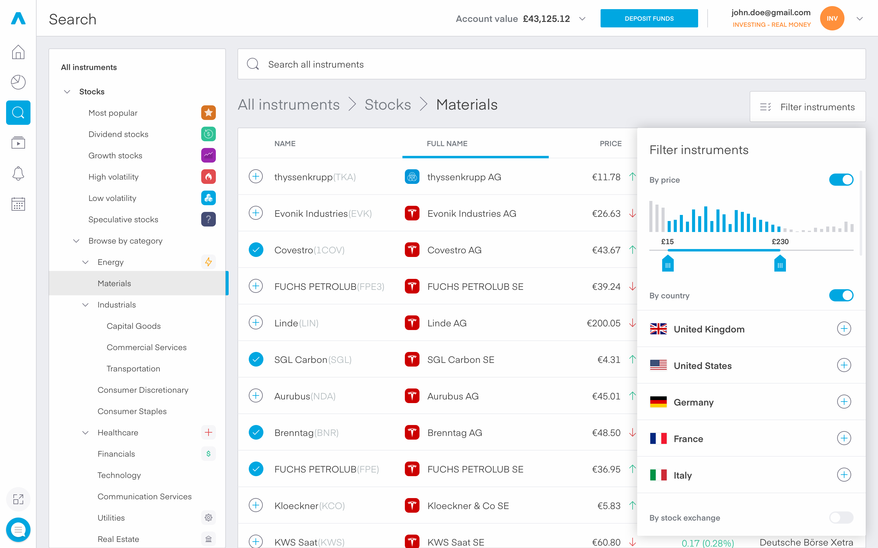
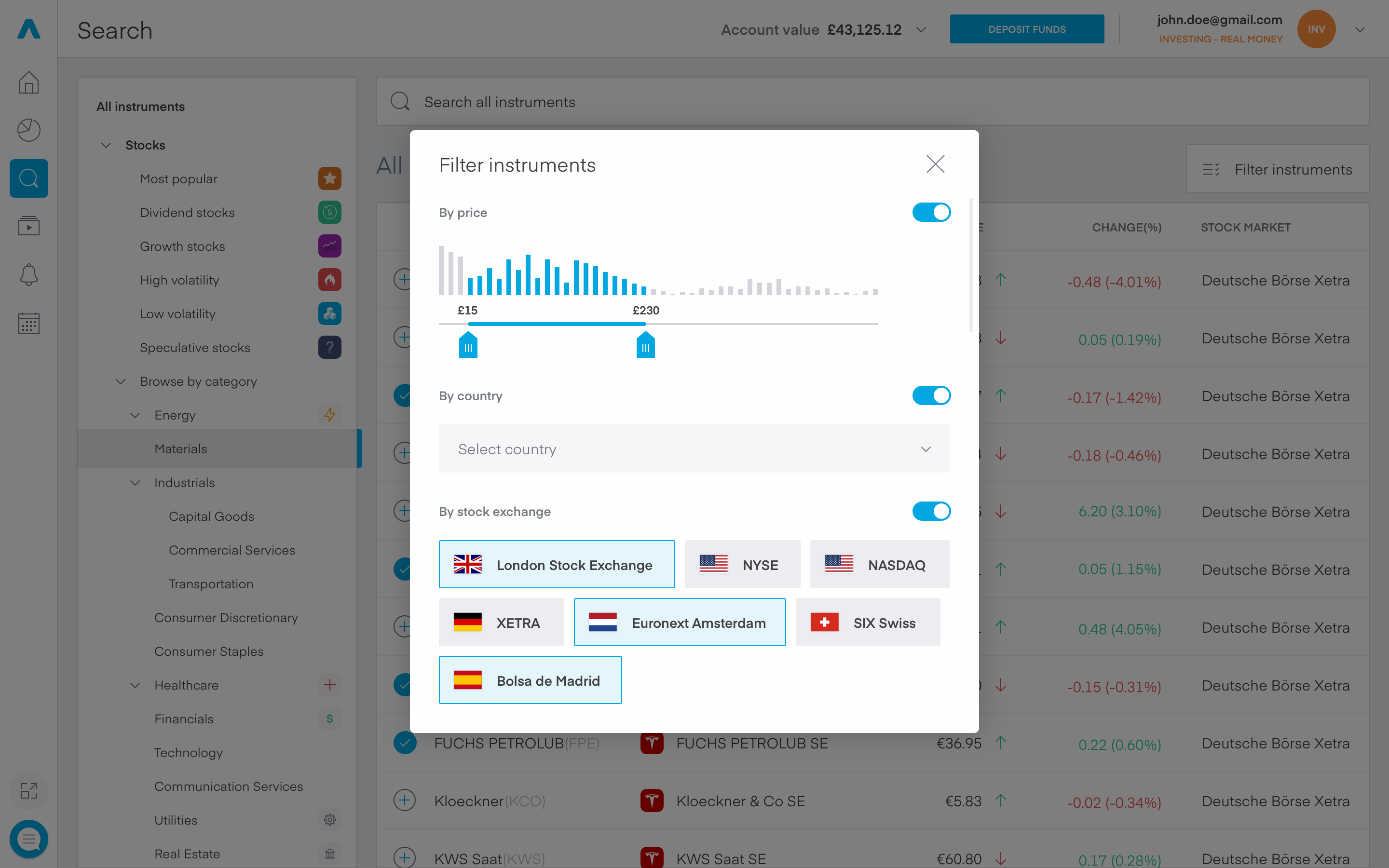
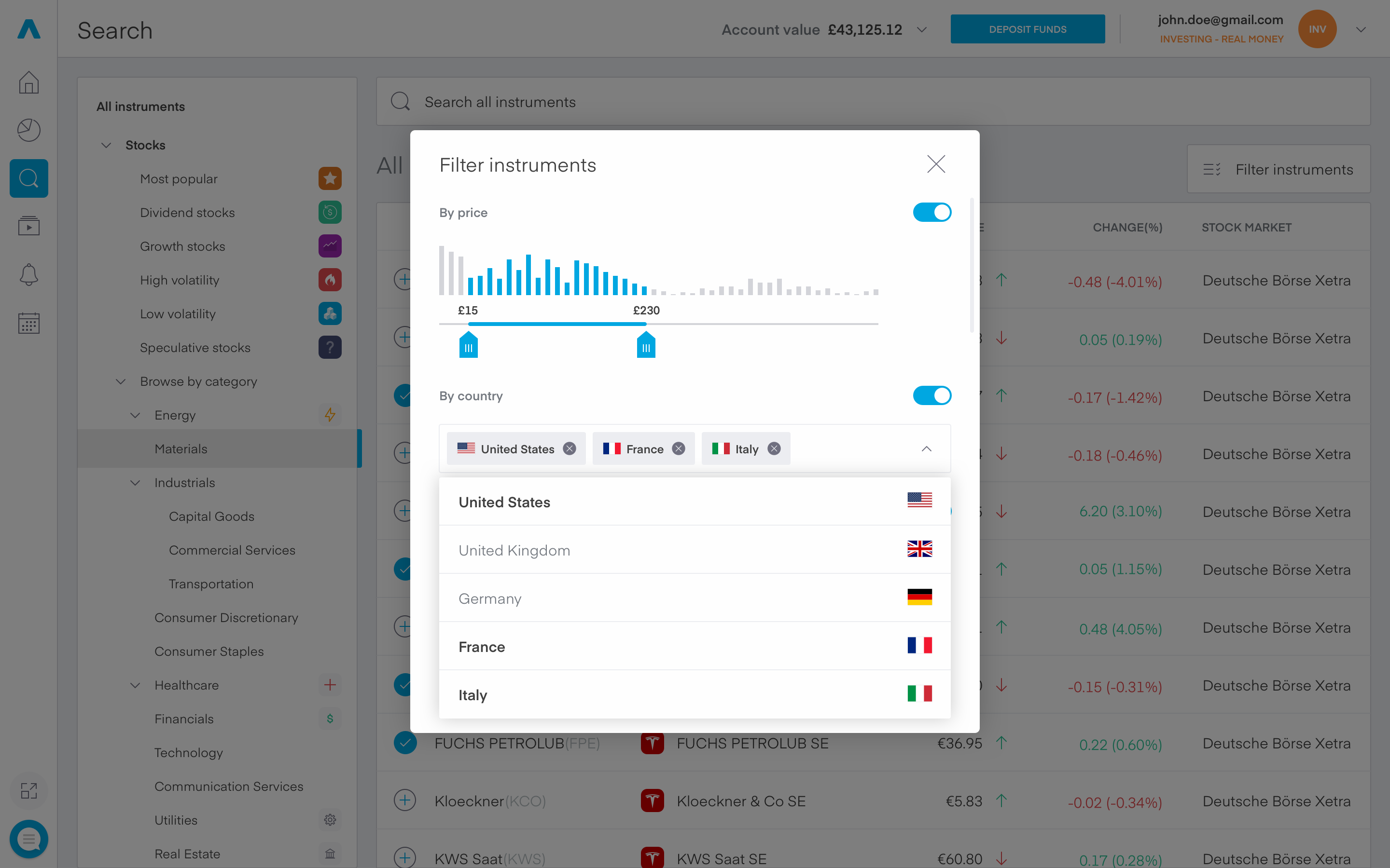
You can see in the screenshot above the initial direction I went with, but the interaction with the components would have led to double or even triple scrollable areas, which as you can guess an awful thing. The solution is shown in the following screens. The new version is better in several key areas:
- Larger items for finer filtration
- Future proof of the country selection
- At the time of writing there are six possible countries, with the possibility of expanding to 30+ in the near future
- Same applies with the addition of new stock exchanges
- The dark overlay is without blur to further visually enhance the experience and keep context for the users. The items in the background will automatically adjust with the different filter selections.
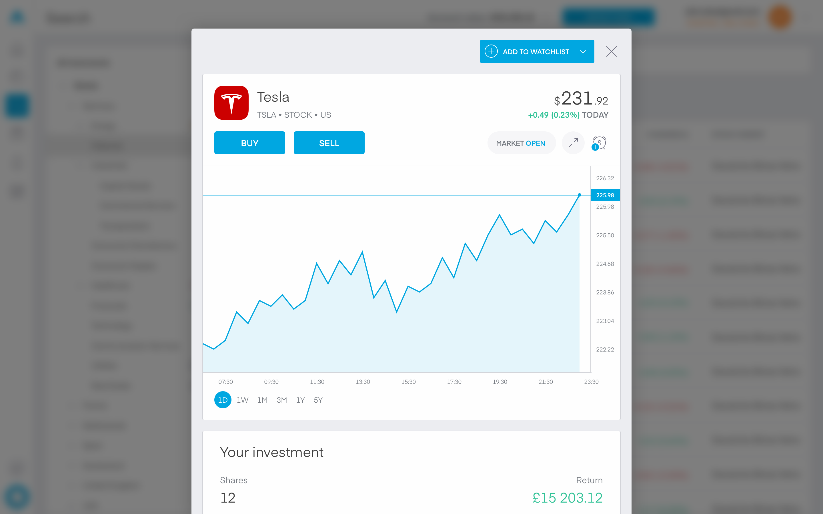
I reused a familiar component for the instrument details encasing it in a frame with a CTA at the top, which gives the users the possibility to add the instrument to a specific watchlist, create a new watchlist with the current selection.
4. Notifications
The offbeat
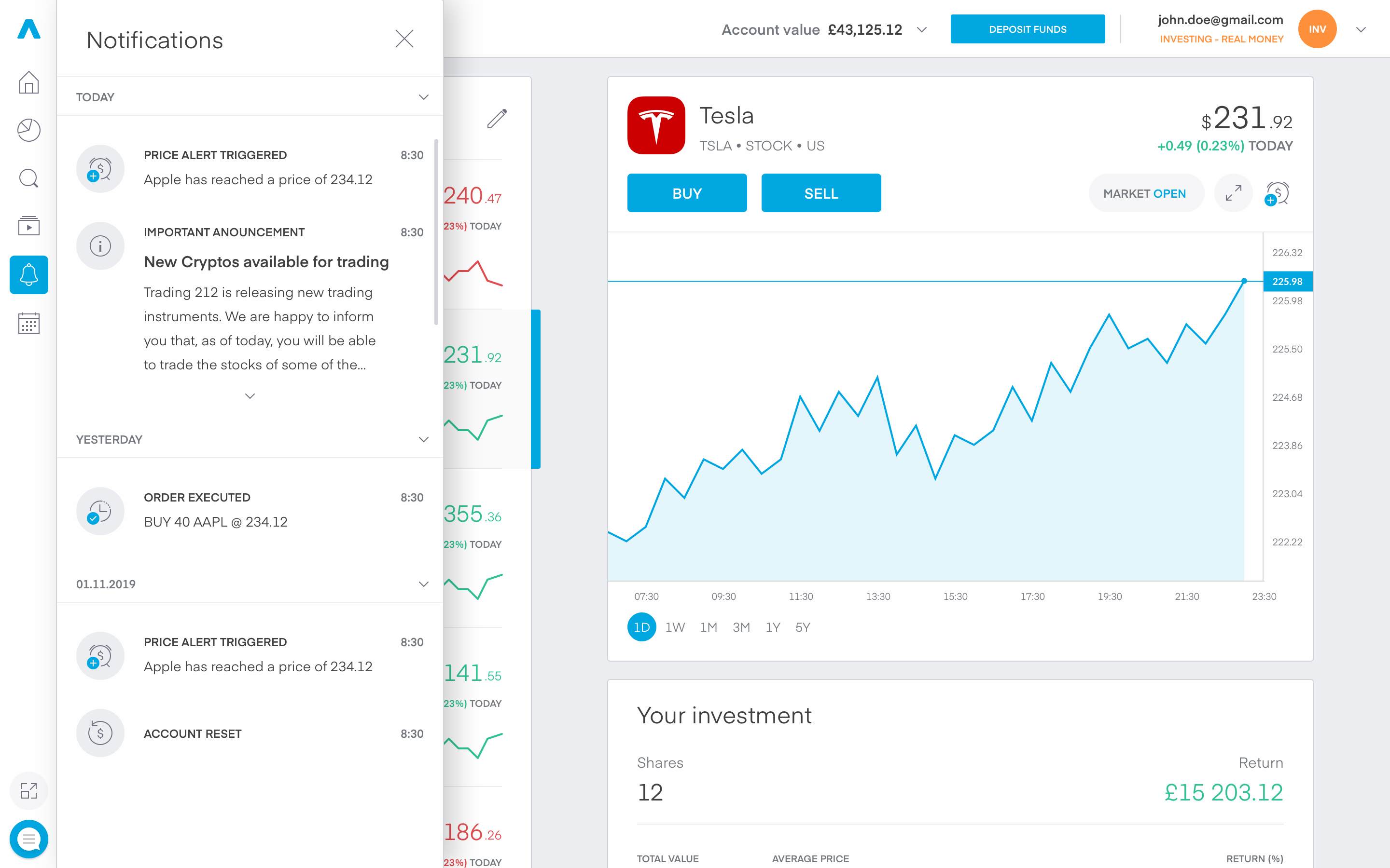
For the first iteration of the platform we decided to keep the notifications simple, yet useful. As you can see in the screenshot bellow, the notifications flyout is the offbeat of the 6 main tabs in its’ structure. The reasoning behind this is very simple:
- We don’t need so much space to view rather simple notifications
- There is no need for context switching, to quickly preview a new notification
With that being said I tried to future proof my concept, as for version 2 we want to add deep links so that when clicking on a specific message the user will be lead to the said component.
A short example will be:
When the user receives a price alert notification for Tesla, and clicks on it, they will be redirected to the Home page with the instrument Tesla being selected.
5. Videos
Untapped potential
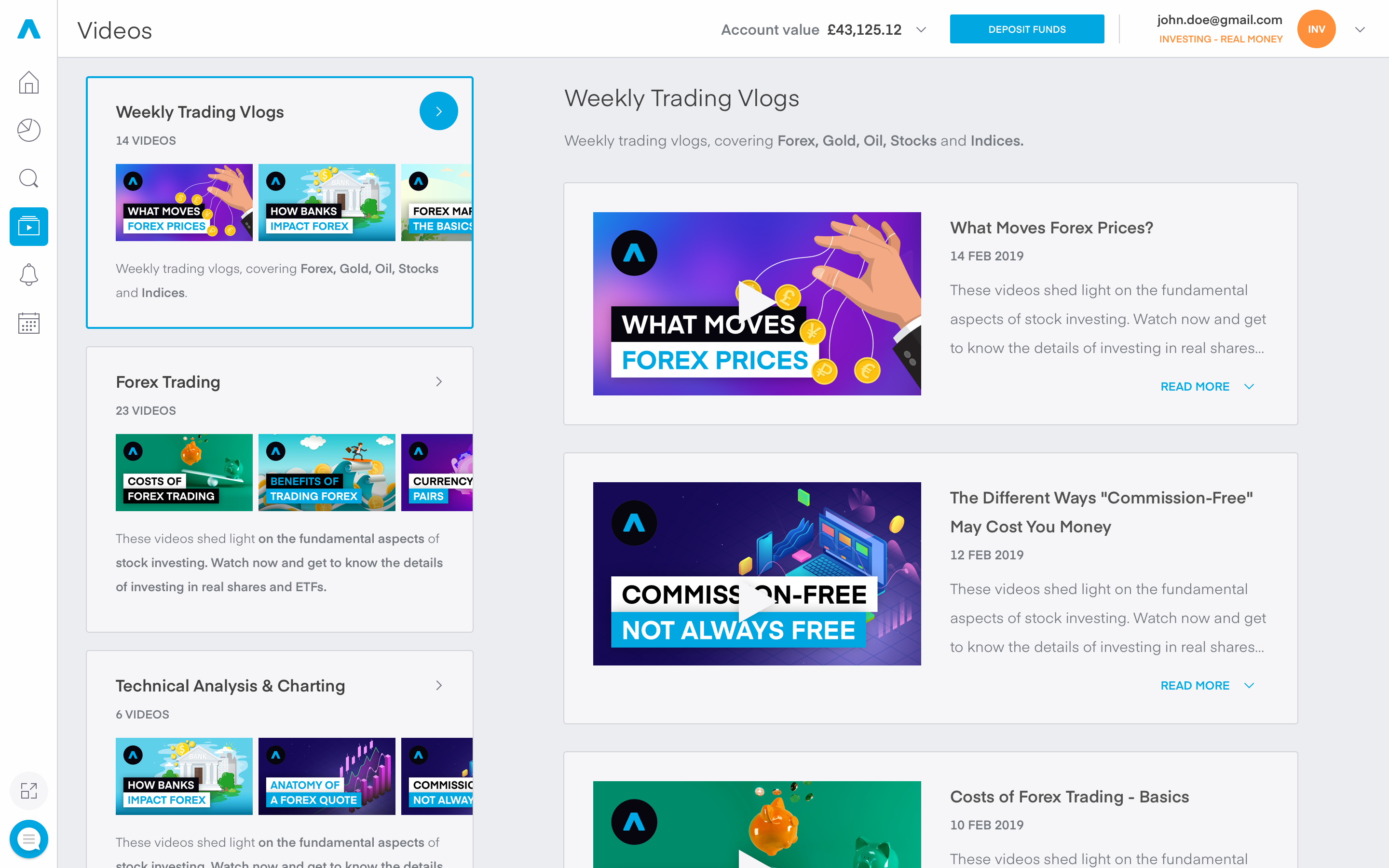
For some strange reason we didn’t emphasize on our YouTube channel (~400k subscribers). Thousands of people watched our educational videos daily, but we didn’t actively promote them to the most important people - our users… For that reason I created a main page only dedicated to them. On the left we have all of our playlists directly curated from our YouTube channel and on the right chronologically ordered videos.
N.B
There is lots of room for improvement, but for non-crucial features, we had to make some compromises.
6. Economic calendar
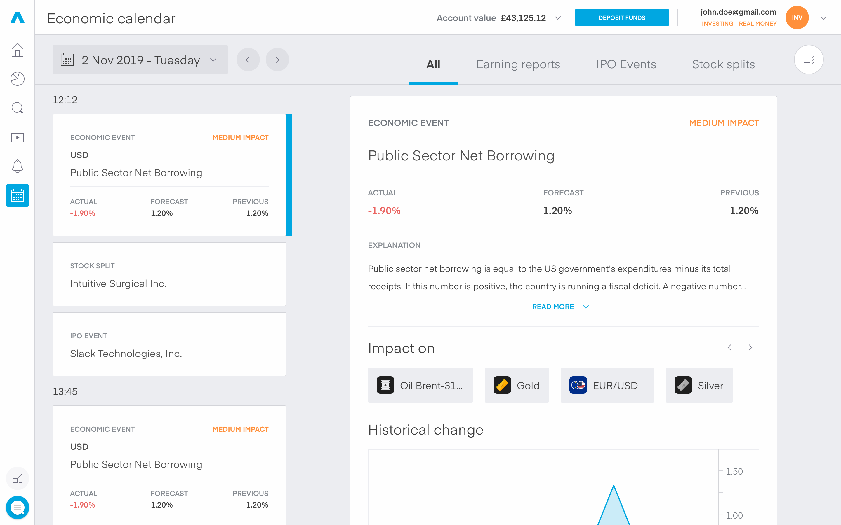
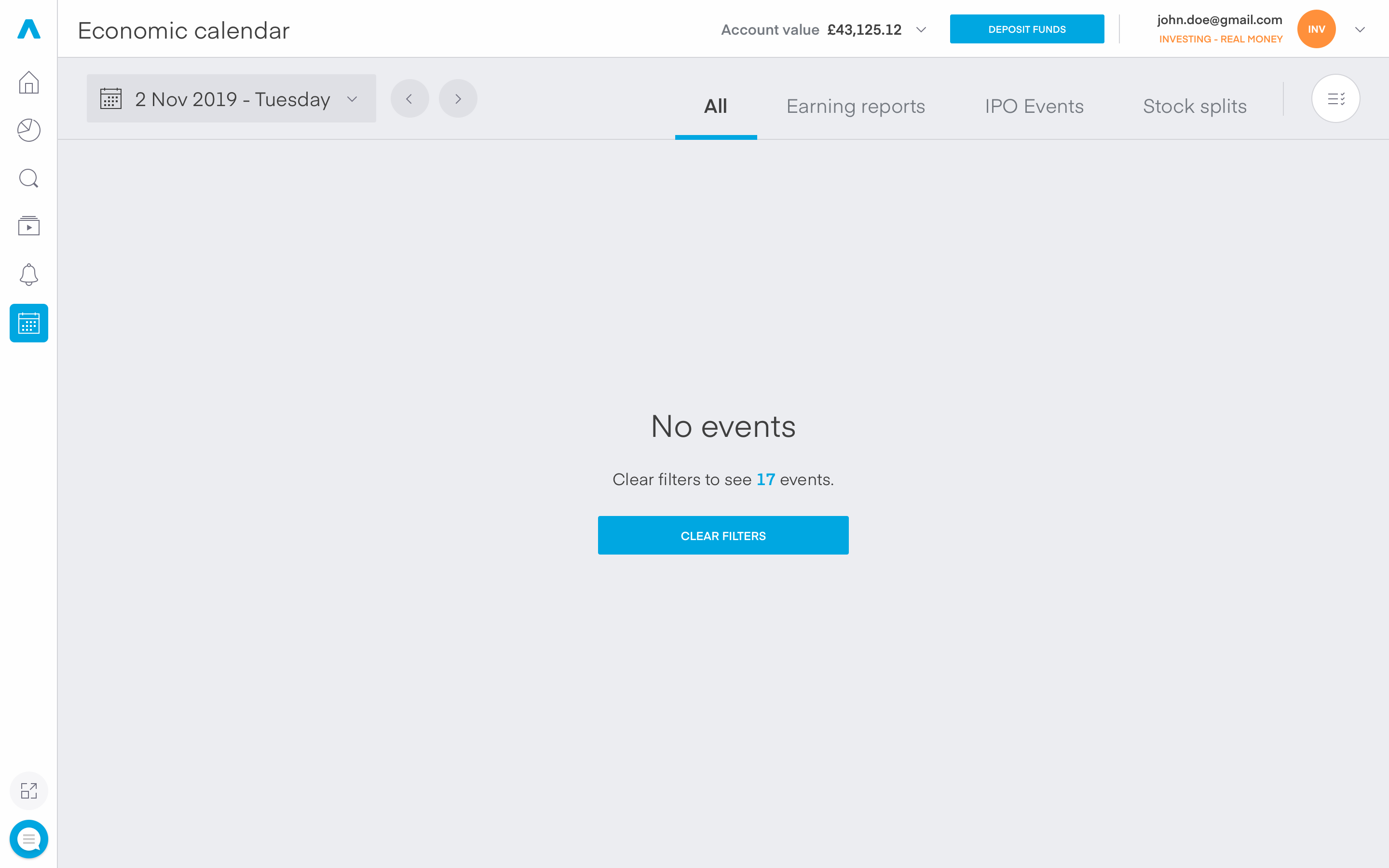
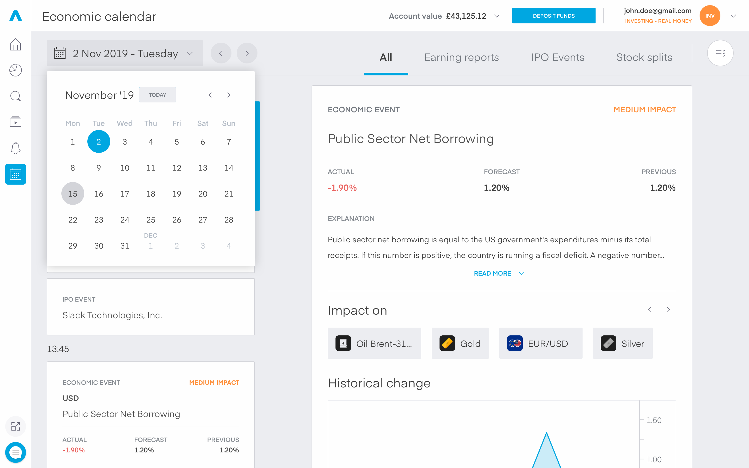
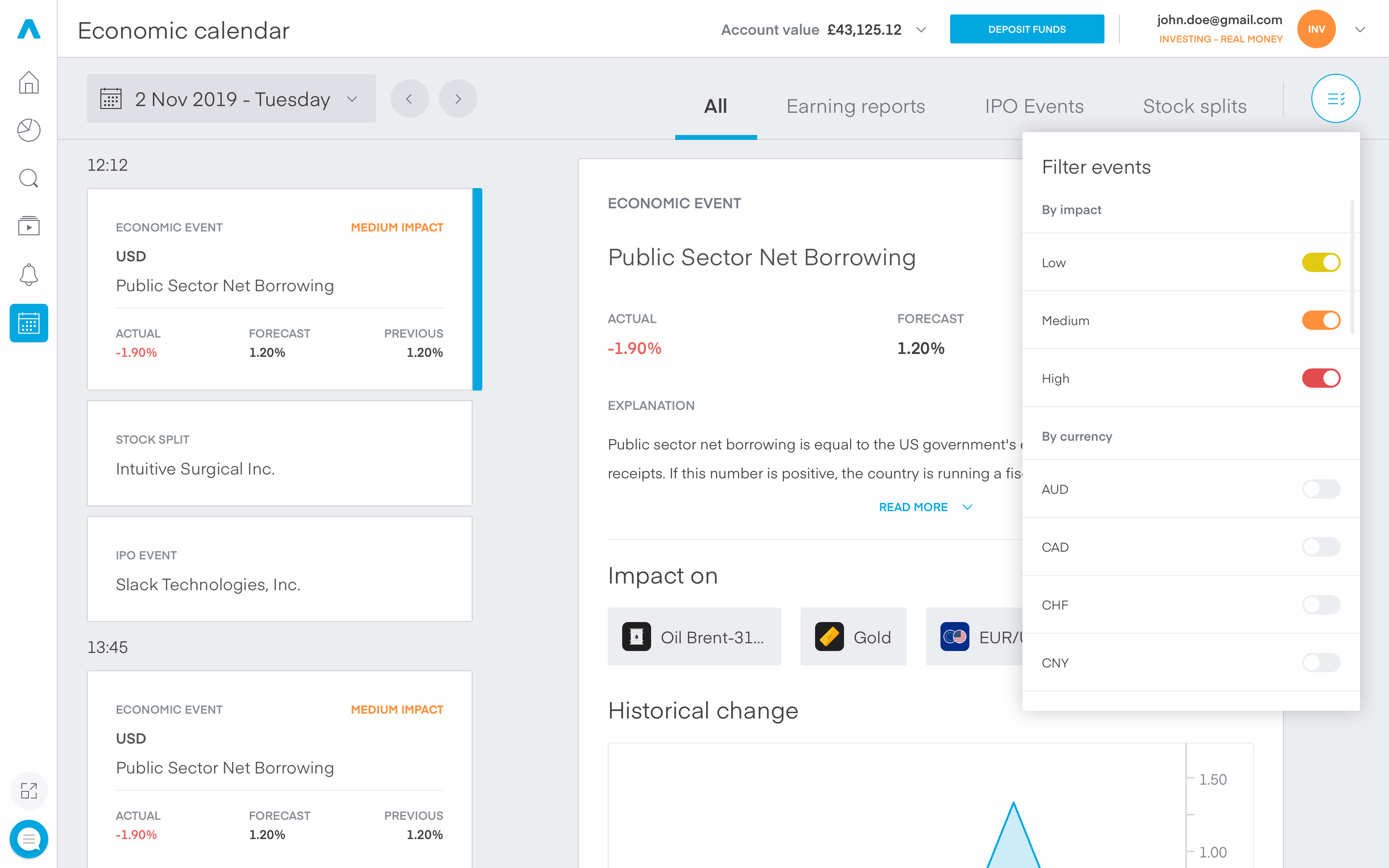
The economics calendar is another feature we made to help out our users. Without forgetting the fact that the main purpose of the platform is to offer the ability to trade stocks, we wanted to make a convenient feature for our customers to see the latest economics news and react appropriately to major economic events. For the first iteration I kept things simple and straightforward. Only basic filters would be done - By currency & by impact. The whole feature revolved around the idea of visualizing an external feed from a reputable news provider, so that our customers have a stellar experience with detailed and authentic information.
You’ve made it through! Thank you for the time spent reading this case study! 🍻
Other projects
Affiliates website
An informative stand-alone website for current and potential affiliates of the company.
Account history
A rather short task which required having loads and loads of data neatly displayed for our users.